Mastering Color Mixing
A Guide to Interior Harmony
In the world of interior design, color is a language all its own. It has the power to evoke emotions, create ambiance, and transform spaces. Understanding color theory and mastering color combinations can elevate your design from ordinary to extraordinary. In this blog post, we’ll delve into the basics of color theory, explore different color combinations, and discuss how to incorporate neutral colors for a harmonious balance

Understanding the Color Wheel
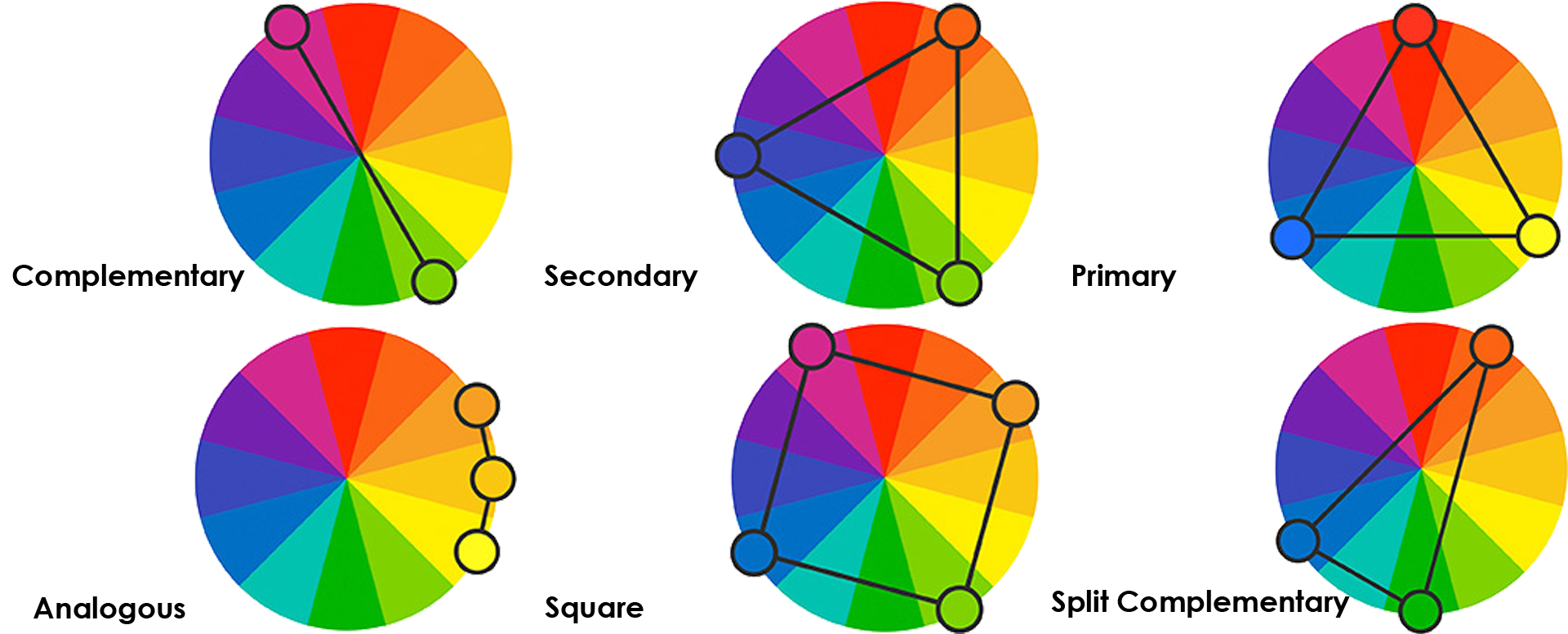
At the heart of color theory lies the color wheel. This circular diagram organizes colors based on their relationship to one another. The primary colors—red, blue, and yellow—are positioned equidistant from each other on the wheel. Secondary colors, such as orange, green, and purple, are created by mixing two primary colors. Tertiary colors are the result of mixing a primary color with a neighboring secondary color.


Primary, Secondary, and Tertiary Colors
Primary colors are the building blocks of all other colors and cannot be created by mixing other colors. Secondary colors are formed by combining two primary colors, while tertiary colors are produced by mixing a primary color with a secondary color.
Neutral Colors
Neutral colors, such as white, beige, gray, and black, provide a versatile backdrop for any color scheme. They act as stabilizers, grounding vibrant hues and balancing out bold palettes.
Color Combinations
- Analogous Palettes: Analogous color schemes consist of colors that are adjacent to each other on the color wheel. For example, combining shades of blue, green, and teal creates a calming and cohesive palette.
- Complementary Palettes: Complementary colors are located directly opposite each other on the color wheel. Pairing complementary colors, such as blue and orange or red and green, creates a dynamic and visually striking contrast.
- Triad Palettes: Triadic color schemes involve selecting three colors that are evenly spaced around the color wheel. For instance, combining yellow, blue, and red creates a vibrant and balanced palette.
- Split Complementary Palettes: Split complementary color schemes are a variation of the complementary scheme. Instead of choosing the direct opposite of a base color, you select the two colors adjacent to its complementary color. This creates a more subtle and harmonious contrast.
- Rectangular Palettes: Rectangular color schemes involve selecting four colors that form a rectangle on the color wheel. Choose one color and its complementary color, then select another color two steps from the first one and add its complmentary color. This combination offers more variety while maintaining balance and harmony.
Incorporating Neutral Colors
Neutral colors serve as the perfect complement to any color palette. They can soften bold hues, provide contrast to monochromatic schemes, and create a sense of balance in eclectic designs. Incorporating neutral colors through furniture, wall paint, or accessories can enhance the overall aesthetic appeal of a space.
Mastering color combinations is key to achieving a harmonious and visually pleasing interior design. By understanding the principles of the color wheel and experimenting with different palettes, you can create spaces that reflect your personal style and evoke the desired atmosphere. Don’t forget to incorporate neutral colors to anchor your design and ensure a cohesive look. So go ahead, unleash your creativity, and paint your world in vibrant hues!
There are online tools to help you find your way around using the color wheel and combining colors. Check out Canva Color Wheel, Adobe Color and Coolors. These websites help you use different color combination methods easily, and extract and create color palettes out of pictures you find inspiring.
After you implement the beauty of colors in your space, it’s time you learn and use textures to bring satisfaction to your design.
